
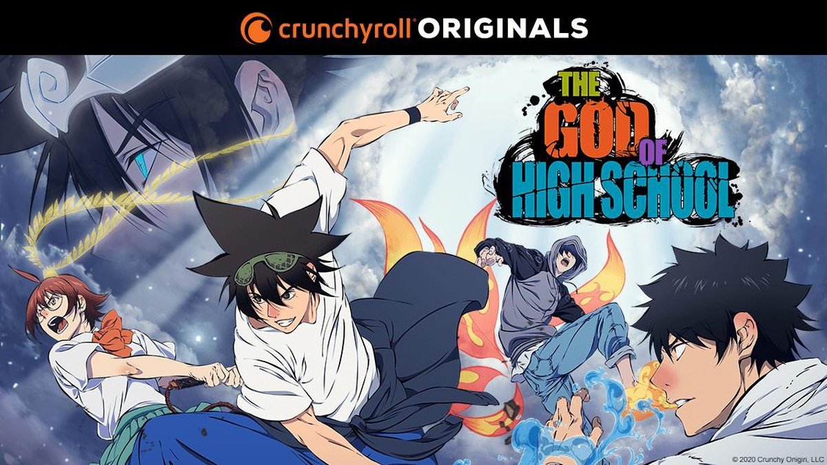
Crunchyroll
Digital Content Crunchyroll, LLC is an American distributor, publisher, production and licensing company focused on streaming anime, manga, and dorama. Crunchyroll's distribution channel and partnership program delivers content to over 100 million registered users worldwide offering over 1,000 anime shows, more than 200 East Asian dramas to users, and around 80 manga titles.
Introduction
Finding Focus
Since this redesign was more focused on how a web user would transition to an app user, rather than using traditional avenues of serving both types of users and finding similarities and differences between the two on how to improve the app experience, i.e. I, a Crunchyroll website user, switched to using their app for a two week period, taking notes of any pain points, issues, or problems that I ran into during my two week evaluation. In addition to my own personal research, I also wanted to tackle any pre-existing issues from users of the app to see if I could improve the experience further. For that portion of research, I looked to Reddit forums and small interviews to gauge current users' feelings concerning the app.
Research
Common Complaints and Criticism
Conclusions from Research
Following the two-week period (see observations below), I was able to narrow down the issue to three main areas, each with their own solution:
For the Home Page, allowing for more breathing room by increasing the spacing between sections, but also adding additional information such a short section description and identifiers to help user navigate content
For the Series Page, increasing focus on individual episodes rather than the series whole to help users not only know what an episode is going to be about, but also which season and language they’re watching it in.
For the Browse Page, cleaning it up and adding a more expansive filtering system to eliminate infinite scrolling

How Might We Statment
Using the information from users and the data gathered from my observation period, I created 3 HMW statements. The goal of these was to create a statement that was wide enough to encompass most if not all of the problems detailed above, but scaled down and focused enough to be able to create a viable solution.
-
HMW make users more confident when selecting a show?
Focus Points
"As a user I get bombed with a list of identical looking entries"
"It’s one of the few streaming services entirely focused on anime, so they have a large catalog"
"For how big the series posters are, they don't really tell you much about the show" -
HMW make finding a new show, series, or season easier for users?
Focus Points
"Whenever an anime gets the updated status on Crunchyroll, I can nothing but wonder, whether there is an actual new episode or season or just a new translation got added"
"Finding something to watch takes so much time, I usually only use it when there's a specific show/movie I want"
"Why isn't an episode summary made available before you select an episode? I need to know what I’m watching" -
HMW decrease the amount of ads a user will see?
Focus Points
"Just making the simple mistake of hitting circle on my controller and backing out of the episode means I'm going to have to sit through 2 minutes of ads"
"4 Ads for 20 minutes of actual content is ridiculous, especially considering they sandwich the intro between two ads meaning you see two ads before you're even five minutes in"
How might we make users more confident when selecting a show?
chosen statementProcess
Current Site Map
In doing the information architecture, I realized there wouldn’t need to be a lot of change from the original design. Most of the biggest changes would concern sub-pages such as the series profile, which instead of the series description being put on an additional page or even in a pop-up, that information would be available on a series’ hub page.

First Attempt
This phase of the process had two overall goals. The first was to accurately translate my initial sketches into something more concrete, and the second was to tackle the issue of card design.
Starting with translating sketches, one thing that I wanted to take from my sketches was the fluidity between each page that was present in the website, but not so much in the app. There was a general structure that was seen throughout, but due to the complexity and amount of content on certain pages, this system would have to be dropped. To combat this, I created an order of information so even if specific points of information had to be dropped, there would still be a common thread throughout.
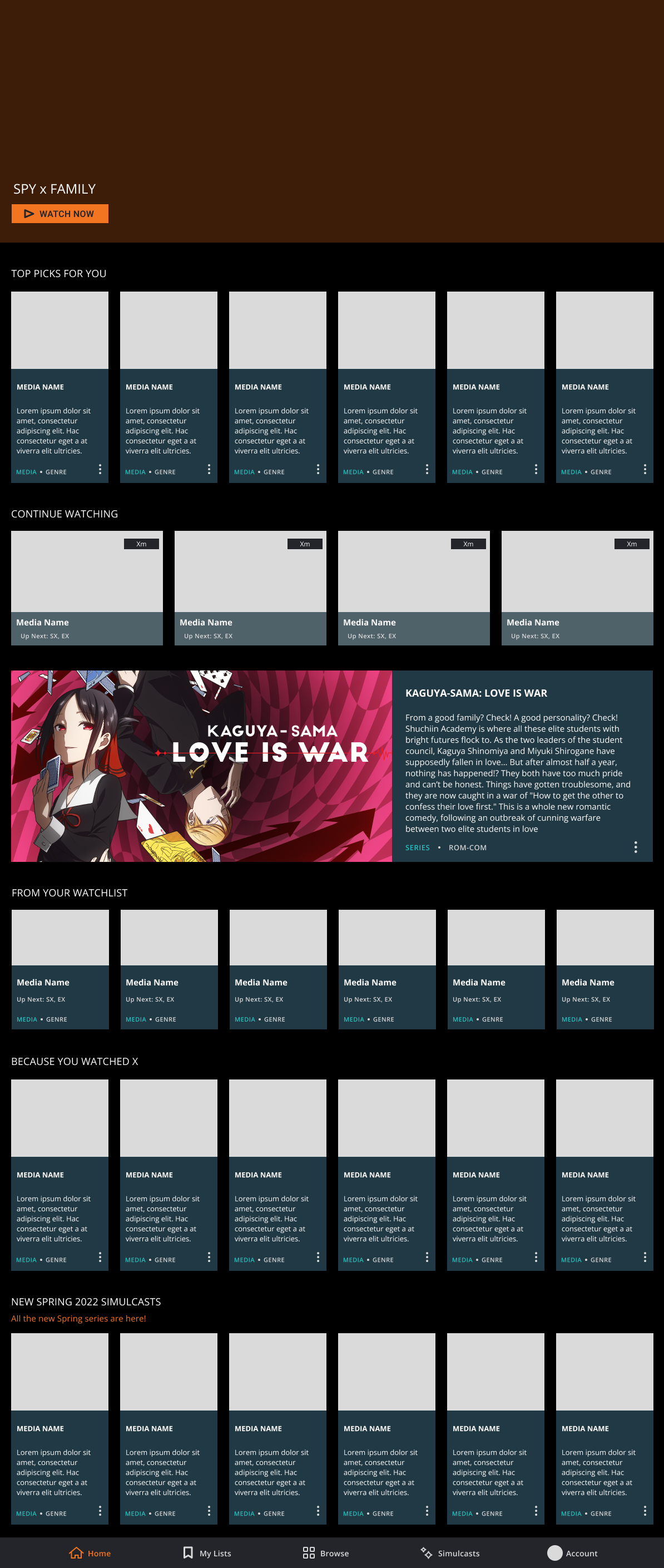
Moving onto card design, one thing I noticed during my observation was that there were two main designs: the vertical design that was used to recommend series, and the horizontal design that was only used on the series page to show episodes. Since the horizontal one had had one instance of being used, it only needed minor touch ups. In contrast, the vertical needed a heavy refresh since it was used heavily throughout, but also served different functions depending on the page. To account for this, I designed it to include additional types of information (Series description and genre). By doing this, I was able to add more relevant information allowing for universal usage.
Further Refinement
The purpose of this phase was to deal with the spacing between elements. I had noted in my observations that all screens but particularly the home screen in particular sections were closely packed together in order to make up for the limited real estate. This however created the problem of images in text tending to blur together making it difficult to differentiate between two cards.
In addition, the added information from the first attempt made it more pressing than ever to make sure that there was adequate gutter space around each card. To do this, using a 12 column grid, I doubled the gutter space from that in the Crunchyroll's current design. This not only allowed for more breathing room, but also allowed me to mix and match card designs in order to better convey information about a particular shower series.

Development of the Home Screen

conclusion
What is Crunchyroll?
Crunchyroll, LLC is an American distributor, publisher, production and licensing company focused on streaming anime, manga, and dorama. Crunchyroll's distribution channel and partnership program delivers content to over 100 million registered users worldwide offering over 1,000 anime shows, more than 200 East Asian dramas to users, and around 80 manga titles.

Live Prototype
This prototype was made through Figma using the template of an iPad Pro 11".
Final Remarks
Here’s What Happened
For what happened, I wrapped up the designing part pretty early then spent the remaining time filling in content and making sure there was consistency throughout each and every page.
Here’s What Really Happened
For what really happened, I think the most challenging part of this exercise was filling in the cotent and making sure it looked the way I wanted. And doing this forced me to work with some aspects of Figma that I hadn’t touched before and allowed me to find some shortcuts to my methodologies.
Takeaways
For where to move forward, I would like to work more with products that have large libraries of content and information to be displayed. I went into this assuming that although filling in the content would be difficult, it wouldn't be too repetitive. However, it also taught me to properly name and set-up your assets and components to save you time and work later.